
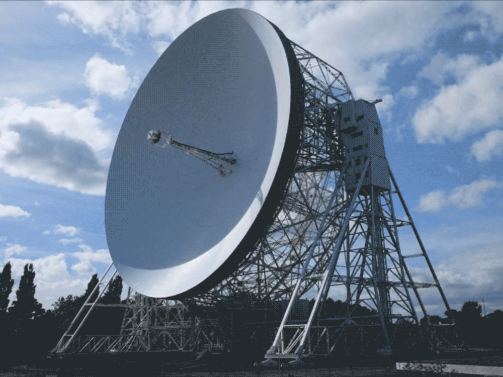

Challenge:
Rebrand the Jodrell Bank Centre for Astrophysics, home of the gigantic Lovell Telescope, UNESCO World Heritage Site and icon of human imagination. Built in 1945, Jodrell Bank pioneered the use of radio waves to understand an unseen universe including quasars, pulsars, gravitational lenses and the Big Bang. Our brief was to encapsulate the sense of curiosity and wonder that Jodrell Bank instills in those who visit through a full identity scheme.
Solution:
A rotating logo that matches the geometry and movement of the immense 250 ft (76 m) telescope dish. The identity system expands into a myriad of elliptical shapes used as patterns, collages and image portals. Fun yet serious, loud yet scientific, the copywriting balances legacy with levity.


The colour palette references the electromagnetic spectrum; ‘Redshift’ alludes to the longer wavelengths where the science of radio astronomy operates. Other colours include the off-white ‘Dish’ of the telescope, and the shades of the skies above Jodrell Bank; ‘Morning’, ‘Day’, and ‘Night’.
Typography is influenced by the heritage of the site and its fascinating stories that run through the heights of the Space Race to the depths of the Cold War.


Studio: Johnson Banks
Client: Jodrell Bank
Creative Director: Michael Johnson
Designers: Beth Johnson, Jonathan Lennon
Account Director: Katherine Heaton
Copywriting: Johnson Banks and Nick Asbury
Animation: Joe Johnson, Emma Nathan